Chapter 3 Working with the Data
When building a predictive model with a sufficiently large data set, it is common practice to hold out some fraction (usually less than 50%) of the data as a test set. It is difficult to provide a general rule for the size of the training and testing sets as the ideal split depends on the signal to noise ratio in the data Hastie, Tibshirani, and Friedman (2009). Figure 3.1 shows a schematic display of splitting the data into training and testing data sets. The process of holding out a portion of the data to be used as a testing set is commonly referred to as the validation set approach or the holdout method.
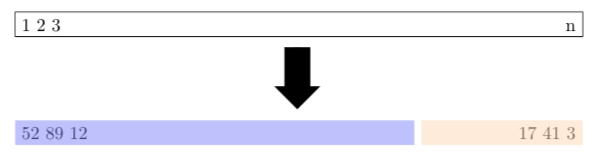
Figure 3.1: Schematic display of the validation set approach based on Figure 5.1 from James et al. (2017). A set of \(n\) observations are randomly split into a training set (darker shade starting with data observations 52, 89, and 12) and a testing set (lighter shade ending with data observations 17, 41, and 3).
For illustration purposes, the Boston data set from the MASS package written by Ripley (2022) is used to illustrate various steps in predictive model building. The Boston help file tells the reader that the data set consists of 506 observations on 14 different variables for houses in Boston collected in 1978. To open the Boston help file, type ?Boston at the R prompt once the MASS package has been loaded. The Boston data set is divided into a training set containing roughly 80% of the observations and a testing set containing roughly 20% of the observations in the R Code below. Before calling the createDataPartition() function, it is important to set a seed to ensure the data partition is reproducible.
library(caret)    # load the caret package
library(MASS)     # load MASS package
set.seed(3178)    # set seed for reproducibility
trainIndex <- createDataPartition(y = Boston$medv,
                                  p = 0.80,
                                  list = FALSE,
                                  times = 1)
training <- Boston[trainIndex, ]
testing <- Boston[-trainIndex, ]
dim(training)
[1] 407 14dim(testing)[1] 99 14The training data set consists of 407 rows which are 80.43% of the original Boston data set, while the testing data set has 99 rows which are 19.57% of the original Boston data set. The createDataPartition() function can also split on important categorical variables. Once a model has been trained with the training data set, some measure of the quality of fit is needed to assess the model. For regression settings, commonly-used measures are mean squared error (MSE), root mean squared error (RMSE), and mean absolute error (MAE) defined in (3.1), (3.2), and (3.3), respectively.
\[\begin{equation} \text{MSE} = \frac{1}{n}\sum_{i=1}^n(y_i - \hat{f}(x_i))^2, \tag{3.1} \end{equation}\]
\[\begin{equation} \text{RMSE} = \sqrt{\frac{1}{n}\sum_{i=1}^n(y_i - \hat{f}(x_i))^2}, \tag{3.2} \end{equation}\]
\[\begin{equation} \text{MAE} = \frac{1}{n}\sum_{i=1}^n\left|y_i - \hat{f}(x_i)\right|, \tag{3.3} \end{equation}\]
where \(\hat{f}(x_i)\) is the prediction that \(\hat{f}\) returns for the \(i^{\text{th}}\) observation. Figure 2.1 highlights the idea that the RMSE the practitioner should minimize is the RMSE associated with the testing data set (\(\text{RMSE}_{\text{testing}}\)) not the RMSE associated with the training set (\(\text{RMSE}_{\text{training}}\)).
3.1 Visualizing and Checking the Data
Visualizing the data allows the model builder to see relationships between the predictors and the response and should always be done before deciding on a functional form for \(f\). In addition to visualizing the data, the model builder can use the function summary() to compute summary statistics on all the variables in a data set. If the data set has missing values, the user must decide how to deal with observations that are missing since many statistical learning algorithms will not accept missing values. Imputing missing values is possible with the preProcess() function from caret. Analyzing and possibly imputing missing values, re-coding values or factors, creating new features from existing data, applying appropriate transformations to variables, and arranging the data in a readable format are all part of what is known as data munging or data preparation. Zhu et al. (2013) points out that few undergraduate texts have data munging exercises which creates a gap in the statistics curriculum. What is common is for textbooks to use clean “tidy” data from either a web page or an R package. Chapter 5 introduces a moderately small data set readers can use to practice their data munging skills.
A scatterplot matrix is an array of scatterplots used to examine the marginal relationships of the predictors and response and is often a good starting point for understanding relationships in the data. The R Code below loads the MASS package and provides code to create a scatterplot matrix using the ggpairs() function from the GGally package written by Schloerke et al. (2021). Figure 3.2 shows scatterplots in the lower triangle of the matrix and density plots of the individual variables along the diagonal and computes and displays the correlation between variables in the upper triangle of the matrix. Based on Figure 3.2, the user might want to transform some of the variables in an attempt to make the scatterplots more linear in form. Additional techniques to visualize the multivariate linear regression model are described in Olive, Pelawa Watagoda, and Rupasinghe Arachchige Don (2015).
library(MASS)     # load MASS package
library(GGally)   # load GGally package
ggpairs(data = training,
        columns = c("medv", "dis", "lstat", "nox", "age", "rm"),
        aes(alpha = 0.01)) +
  theme_bw()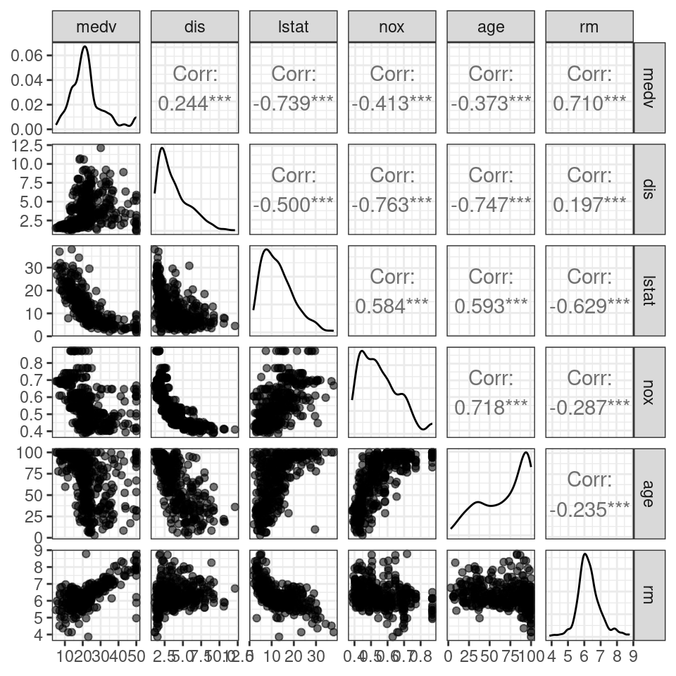
Figure 3.2: Scatterplot matrix for a subset of variables in the training data set.
3.2 Pre-Processing the Data
Some algorithms work better when the predictors are on the same scale. This section considers the preProcess() function for the caret package to find potentially helpful transformations of the training predictors. Three different transformations are considered: center, scale, and BoxCox. A center transform computes the mean of a variable and subtracts the computed mean from each value of the variable. A scale transform computes the standard deviation of a variable and divides each value of the variable by the computed standard deviation. Using both a center and a scale transform standardizes a variable. That is, using both center and scale on a variable creates a variable with a mean of 0 and a standard deviation of 1. When all values of a variable are positive, a BoxCox transform will reduce the skew of a variable, making it more Gaussian. The R Code below applies a center, scale, and BoxCox transform to all the predictors in training and stores the results in pp_training. The computed transformations are applied to both the training and the testing data sets using the predict() function with the results stored in the objects trainingTrans and testingTrans, respectively. Note that the response (medv) is the last column (\(14^{\text{th}}\)) of the training data frame and is removed before pre-processing with training[ , -14].
pp_training <- preProcess(training[ , -14],
                       method = c("center", "scale", "BoxCox"))
pp_training
Created from 407 samples and 13 variables
Pre-processing:
- Box-Cox transformation (11)
- centered (13)
- ignored (0)
- scaled (13)
Lambda estimates for Box-Cox transformation:
Min. 1st Qu. Median Mean 3rd Qu. Max.
-1.00 -0.15 0.20 0.40 0.90 2.00 trainingTrans <- predict(pp_training, training)
testingTrans <- predict(pp_training, testing)Figure 3.3 uses the same variables as Figure 3.2 after applying center, scale, and BoxCox transforms to the predictors. Note that density plots found on the diagonal of Figure 3.3 appear less skewed than the density plots of the un-transformed predictors found on the diagonal of Figure 3.2.
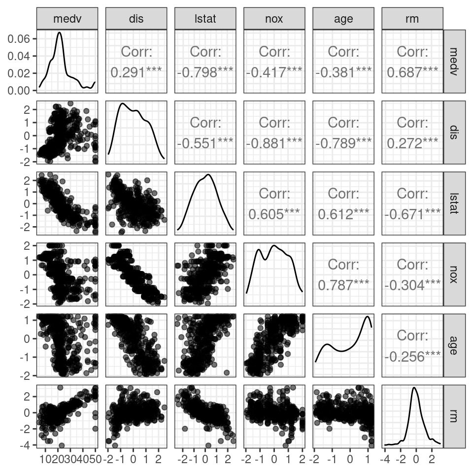
Figure 3.3: Scatterplots of centered, scaled, and transformed predictors